Designing in space
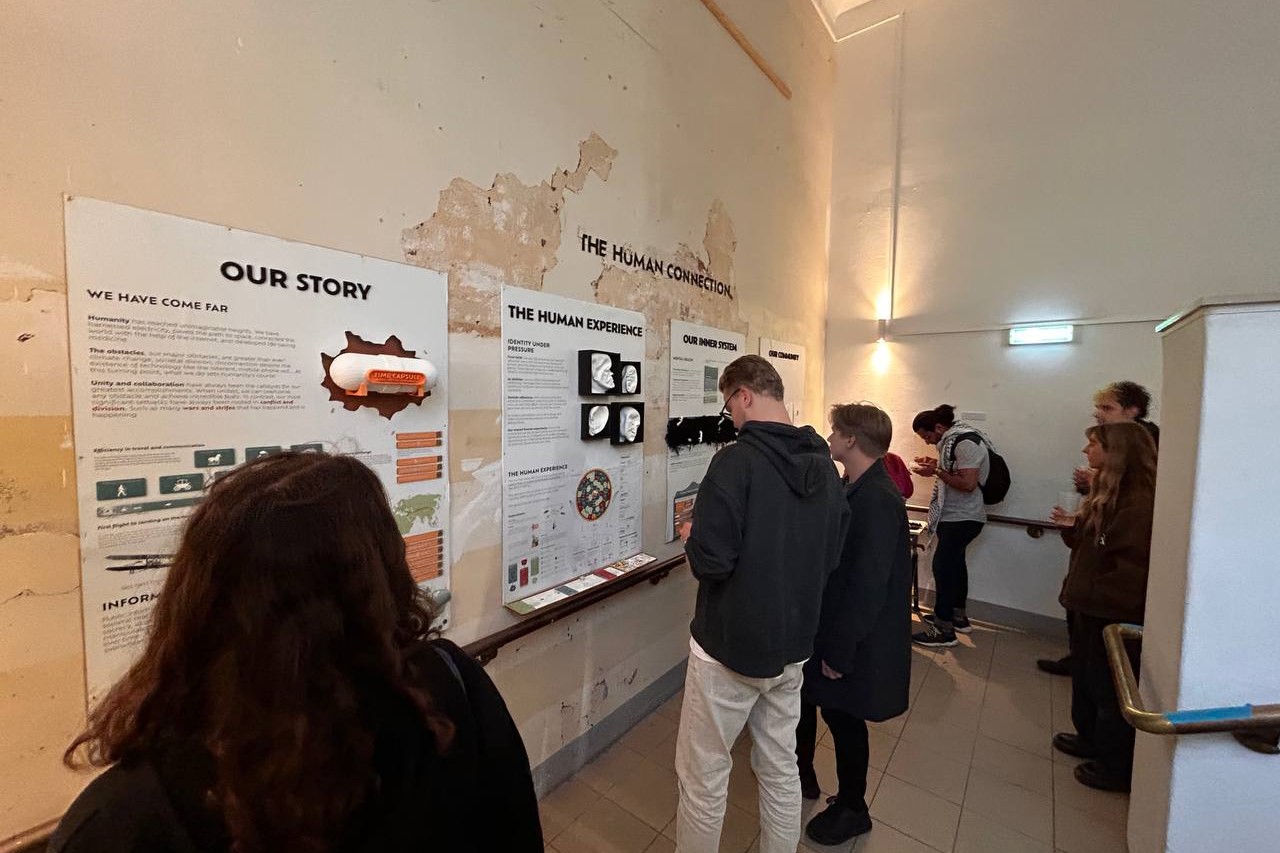
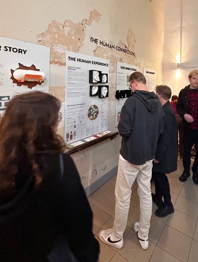
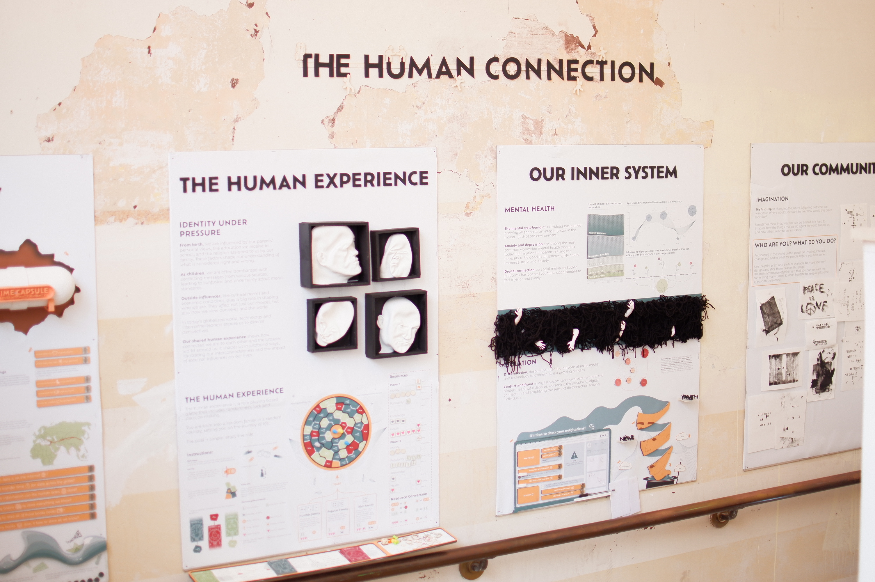
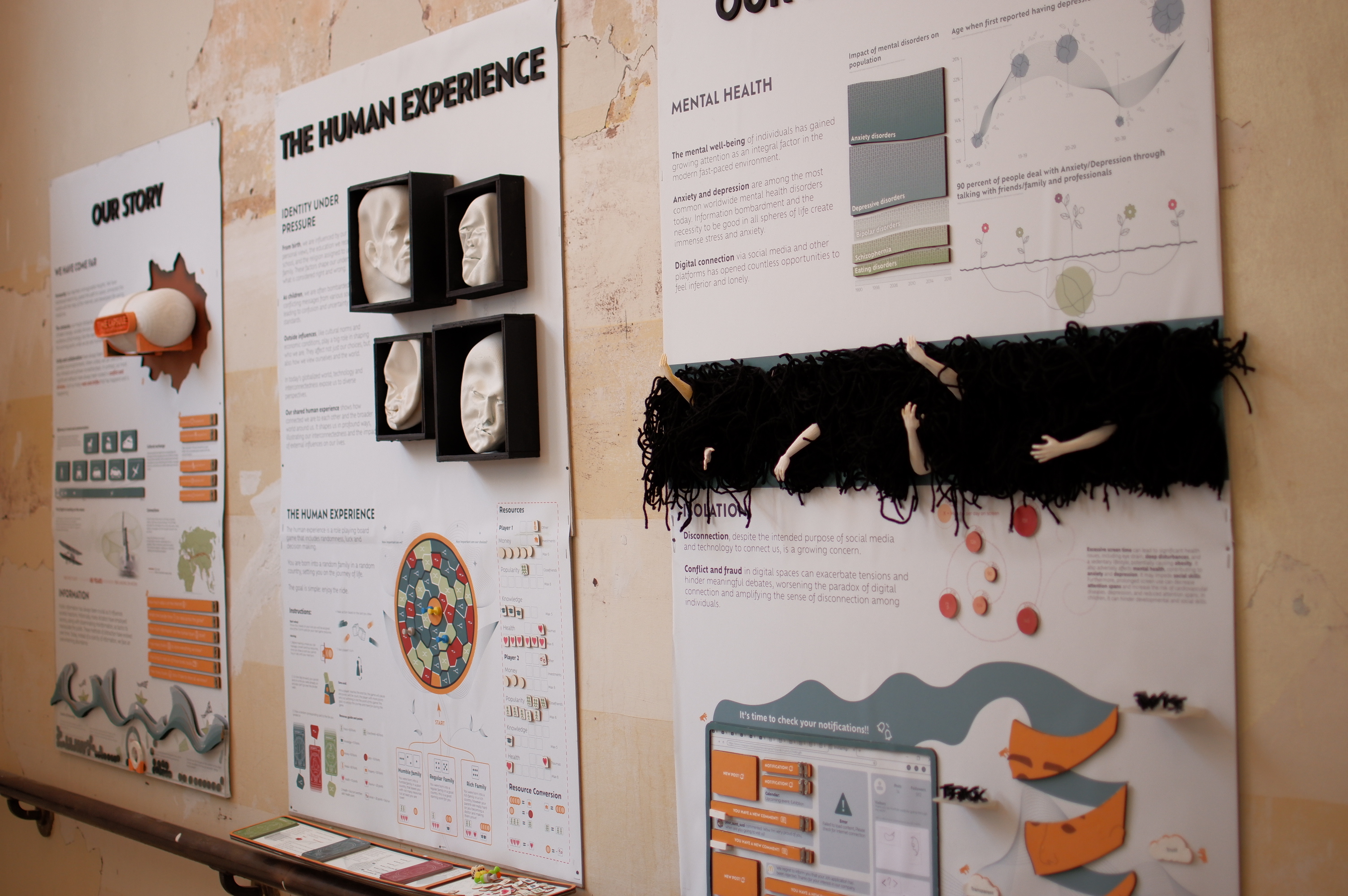
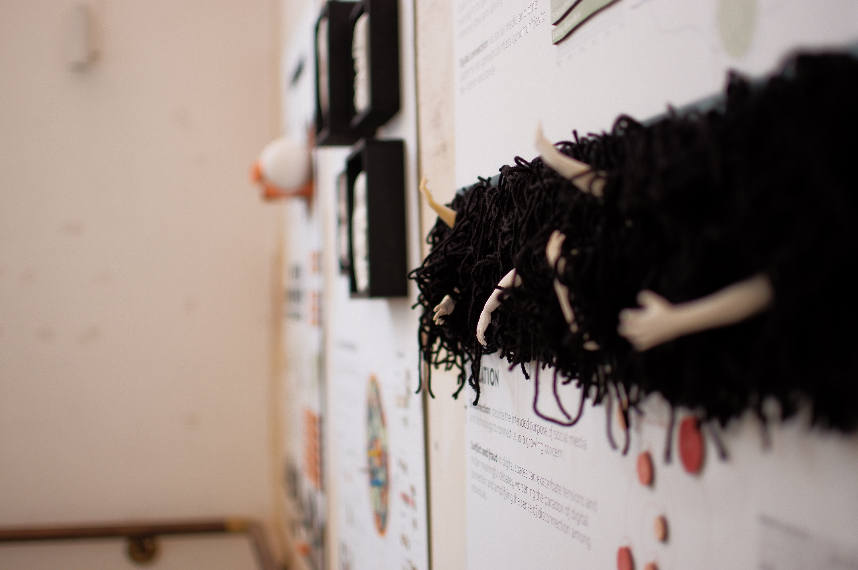
Our world is three-dimensional, and everything exists within these three dimensions. Designing in space means that another dimension of hierarchy is added. Traditionally, graphic design is very flat, and designs seem small in space, which leads to information being overlooked as the third dimension, depth, is not being used in hierarchy. Some flat designs use shadows and other techniques to fake this dimension. However, in the context of an exhibition, this third dimension can be utilized through sculptures and other physical separations from the flat poster.

Learning Through Interactivity
visitors have no obligation to stop and read what is written, however the information is still important nonetheless. In this case it is important to have visitors read, question, debate, think and Analyze. The lack of active learning can lead to ineffective learning no matter how interesting the actual content is.
By introducing interactive elements that invite hands-on exploration, passive viewing transforms into active engagement. These interactive features capture attention and ensure visitors are actively involved, making the experience more immersive and memorable.
Although straightforward in digital media, this method requires creative analog solutions.

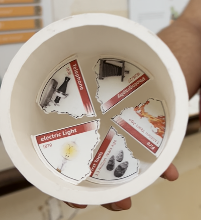
This work employs various methods to engage the audience in interaction, such as doors with questions and answers on the back, containers that can be opened and closed, interactive sculptures with magnets that can be manipulated, a print press allowing the audience to leave a trace of themselves in the piece, a board game and agamograph sculptures that require movement to view different messages from different perspectives.
Sculptures
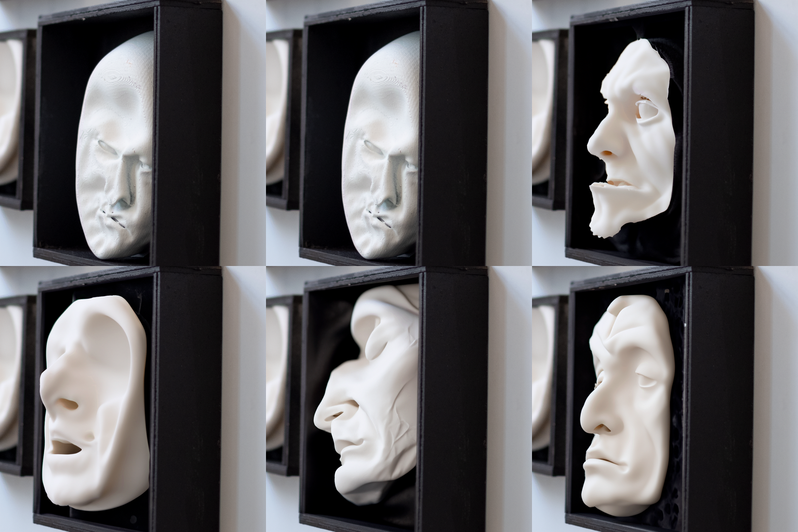
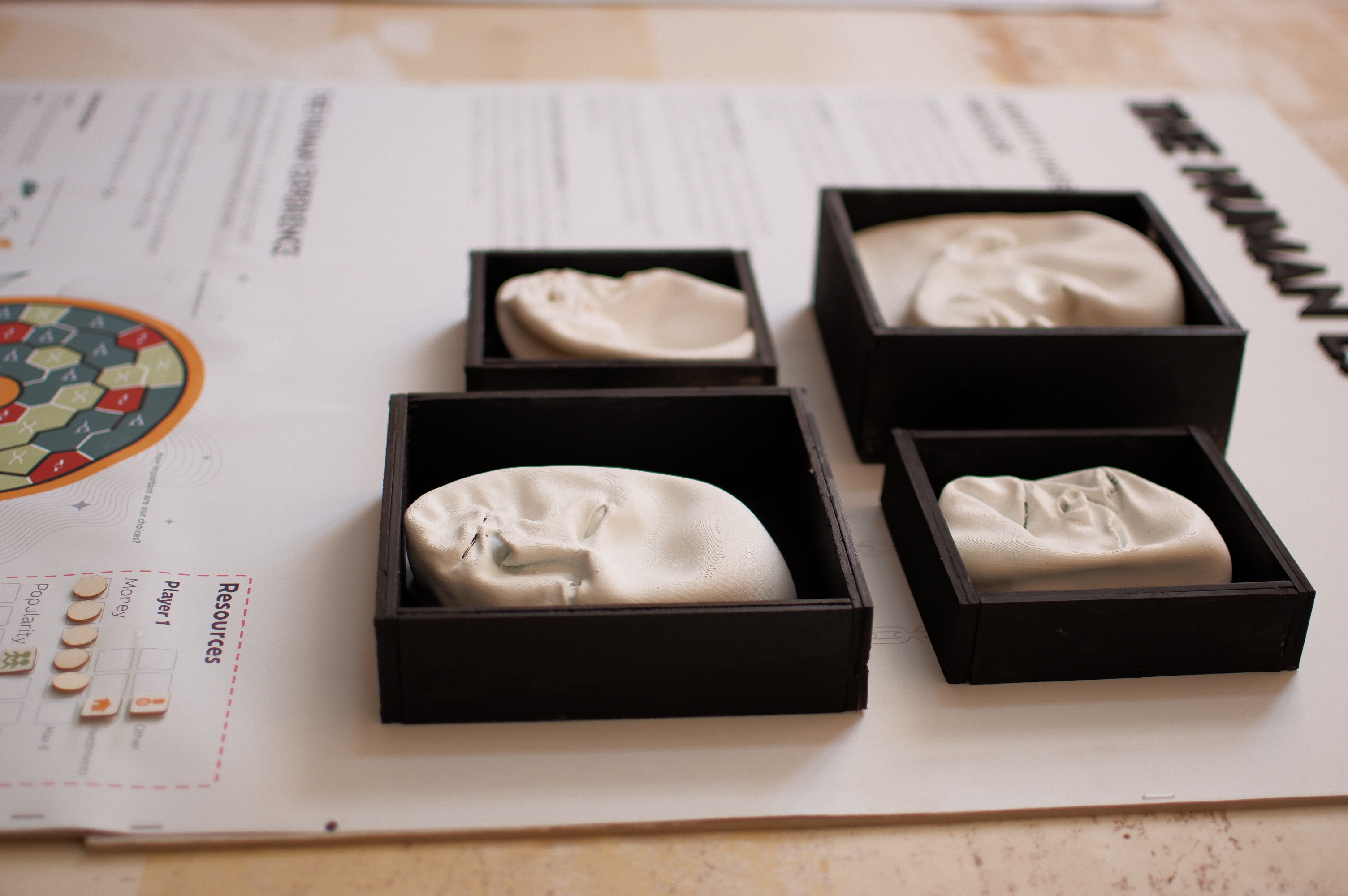
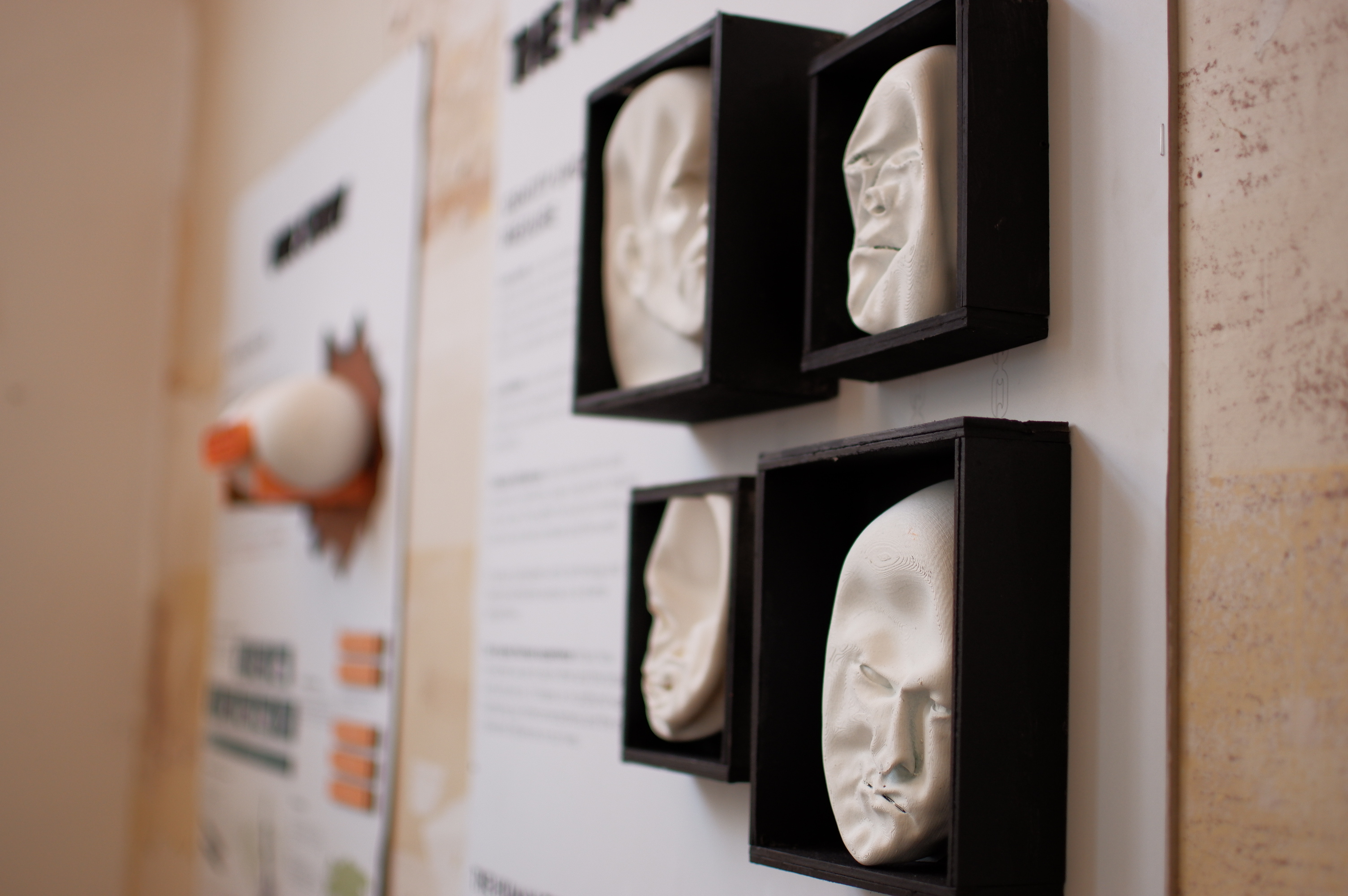
Using sculptures and installation is a great way to add a new layer of communication to the work. Abstract sculptures encourage the audience to wait and process the meaning behind the sculptures and connect them to the presented information in the work.
sometimes less is more.

Visualising Data
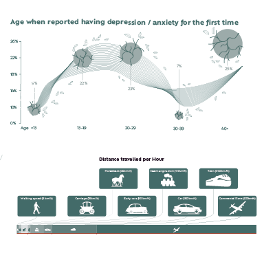
Visualizing data and simplifying information are essential aspects of my design process. This work includes many data visualizations intended to simplify complex information, making it easily understood at first glance, while strategically organizing it to ensure the visitor is not confused. The process of data visualization goes beyond just creating visuals; it also requires thorough research on the topic, collaboration with other experts, and an in-depth study of relevant subjects.

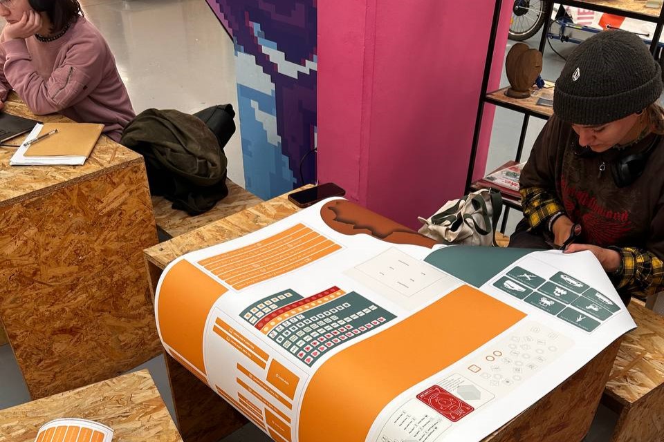
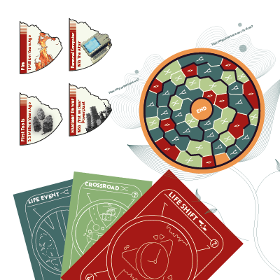
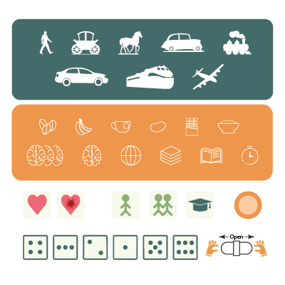
The human experience board game
This work employs various methods to engage the audience in interaction, such as doors with questions and answers on the back, containers that can be opened and closed, interactive sculptures with magnets that can be manipulated, a print press allowing the audience to leave a trace of themselves in the piece, a board game and agamograph sculptures that require movement to view different messages from different perspectives.

Leaving a trace
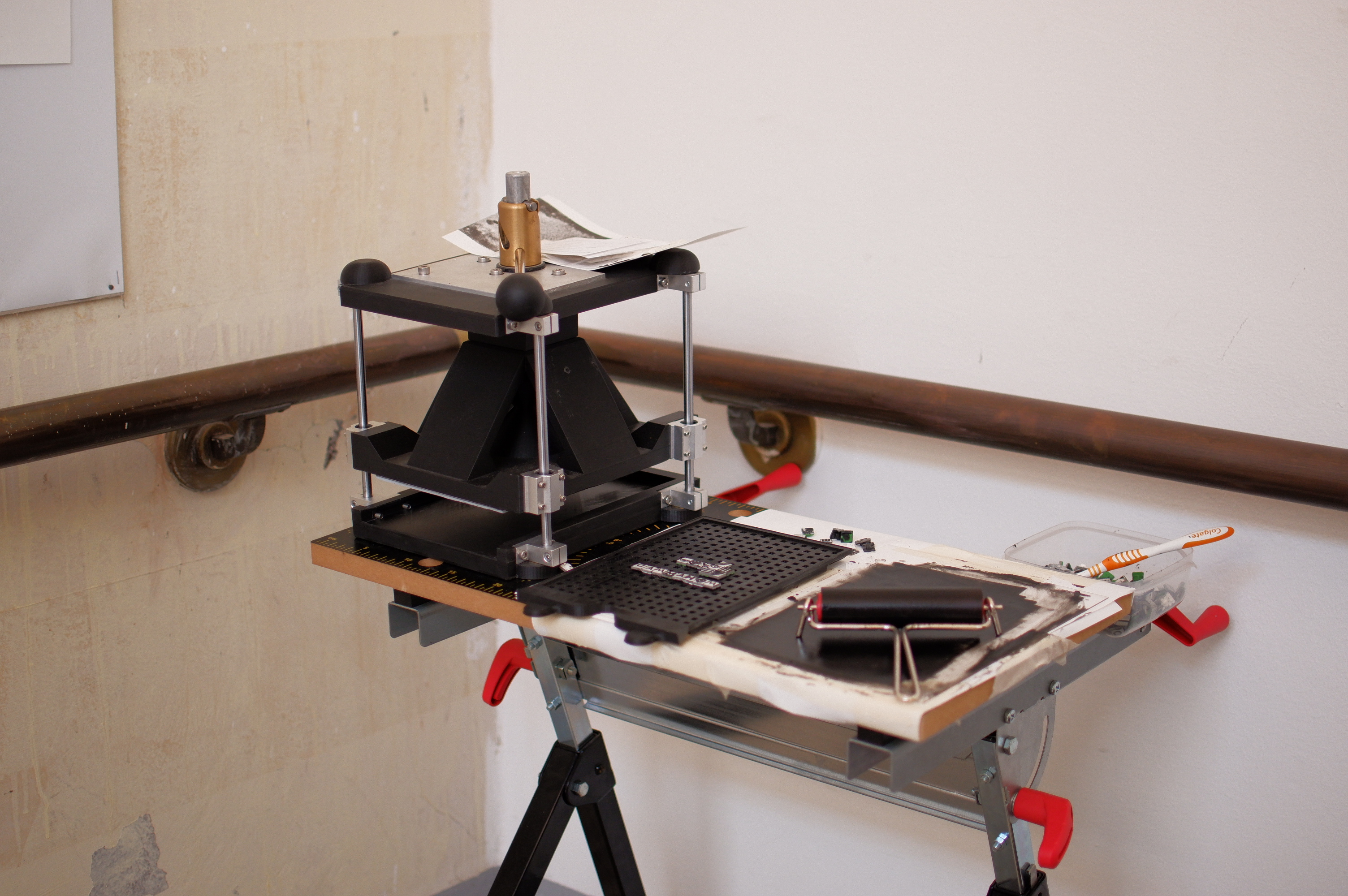
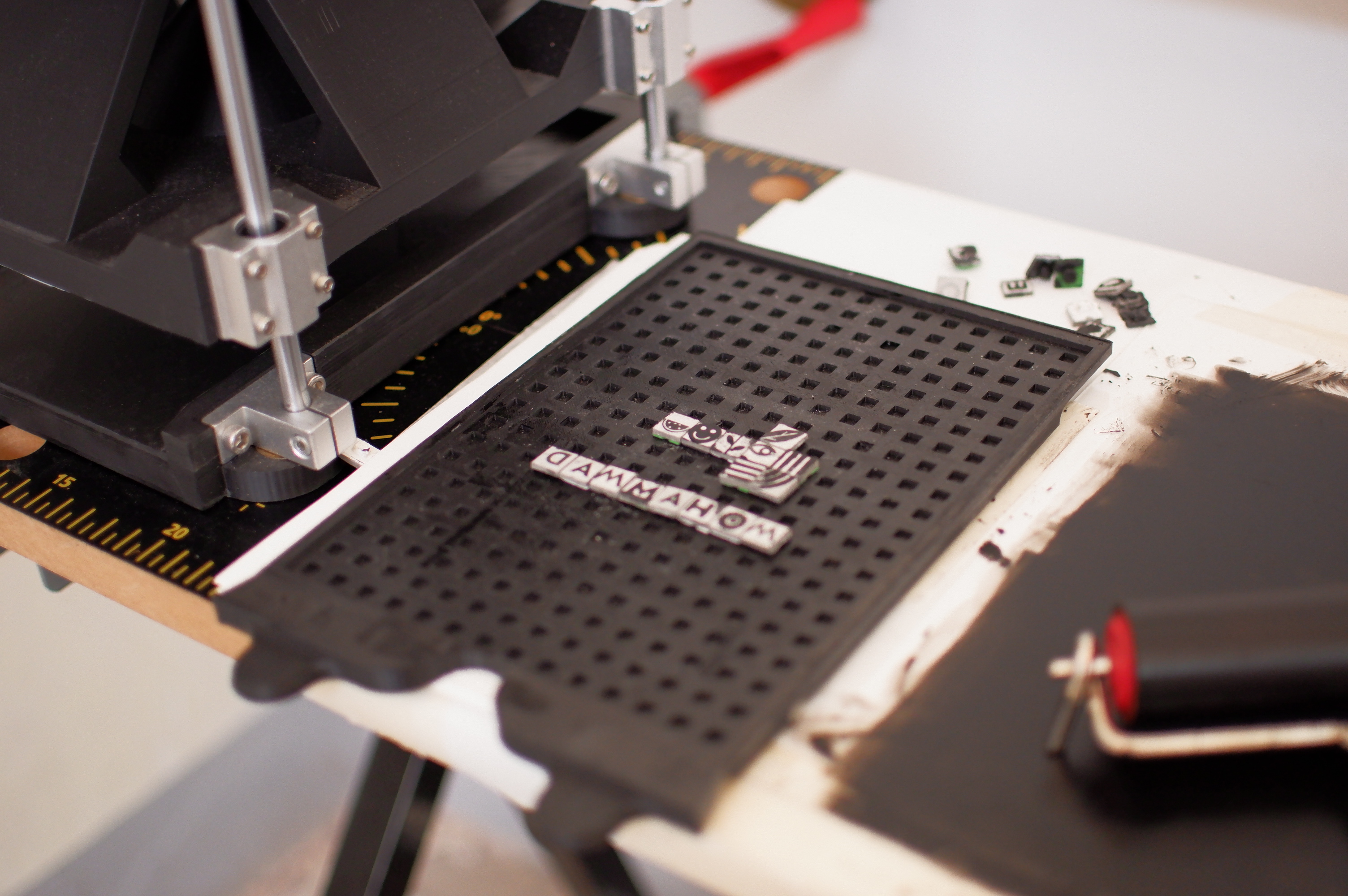
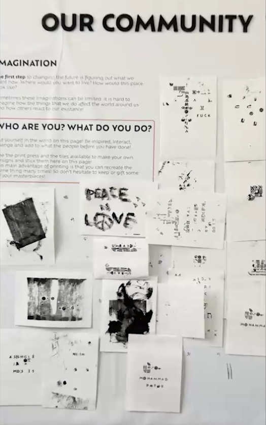
The Gutenberg press at the exhibition, inspired by a mix of Lego and printmaking, allows visitors to create multiple copies of their artwork. This activity fosters a sense of community as visitors can keep, gift, or leave their prints. Since printmaking is more time-consuming than traditional drawing, premade tiles and blocks were created to simplify the process. These tiles, which attach like Lego pieces, offer various designs and can be expanded in the future. Developing the press was challenging due to limited online resources, leading to creative solutions like using parts from an old espresso machine to make the press user-friendly and efficient.
Big thanks to David Kier for designing and building this press <3
Visual Identity
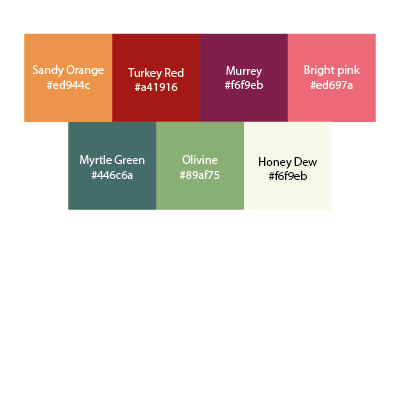
The visual identity of an exhibition is crucial for creating a cohesive experience, helping all elements blend together. Understanding the target audience, primarily aged 20-30 and 40-60, is key to designing interactive elements. The chosen typeface, Ofelia Text, ensures readability and an inviting feel, with a clear hierarchy established through various font sizes. A carefully selected color palette, including Turkey red and Myrtle green, unifies the design while enhancing emotional impact and guiding visitors intuitively. Simple illustrations and icons emphasize connection and interaction, particularly in the board game and Gutenberg press, balancing uniqueness with simplicity
